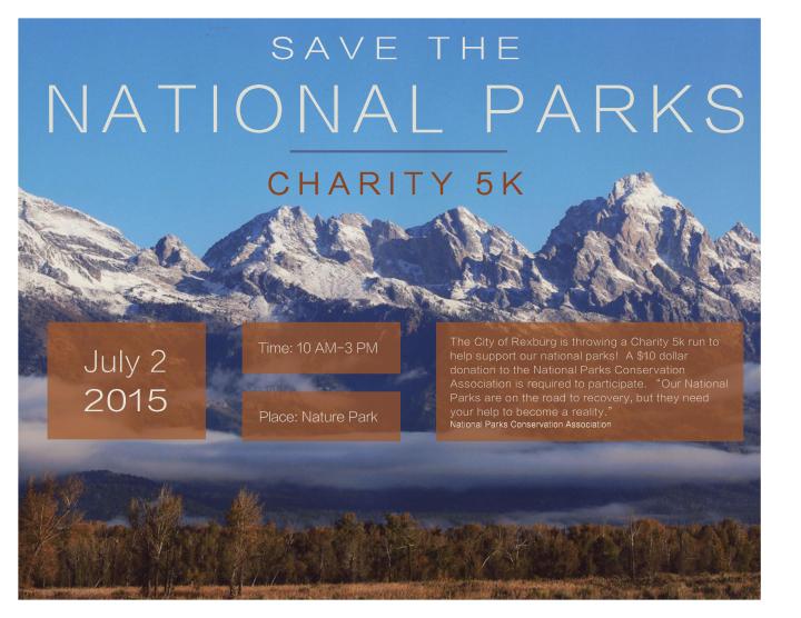
- Description: A full color Event Ad to promote doing a charity 5k to raise money for our National Parks.
- Process (Programs, Tools, Skills, FOCUS principles): First I brainstormed ideas for which type of event I should do. After I decided, I located a picture of mine to use for the project. Next, I made sketches of different possible design layouts. When I chose a design layout, I started putting it together into word. After finalizing my rough draft and having it critiqued, I adjusted it to the final product.
- Message: I am promoting a Charity 5k to raise money for our National Park Organizations. The message I am trying to get across is that this is a fun event for a good cause.
- Audience: People of the community, and more specifically, nature lovers.
- Color scheme and color names: The color scheme I used was complementary. I used the colors burnt orange and navy blue.
- Top Thing Learned: The top thing I learned is that knowing what information to include in your Ad is just as important as the design, because if you forget to put certain information in there, the design is pointless.
- Title Font Name & Category: I used the san serif font called “Lantinghei TC Extralight
- Copy Font Name & Category: I used the san serif font called “Lantinghei TC Extralight,” for the copy font as well.
- Scanned images used, sources, original sizes, location of scanner used: The image used in this design is a beautiful picture taken of the mountains in Grand Teton National Park. This photo is one of my own personal photos that was located on my computer, so first I had it printed in high quality at Walmart. It was originally printed as an 8×10 photo. I then took this photo to the mac lab at BYU-Idaho to scan it and use it in my design.
- Comment
- Reblog
-
Subscribe
Subscribed
Already have a WordPress.com account? Log in now.

The color scheme worked really well with this scanned image and it looked like a professional flier. I also liked the way the image was naturally divided into sections from the tree line, clouds, and mountain ridge. The text was easy to read and identify and the information was organized well with the alignment. The design is simple and effective in communicating a message of this charity event for nature.
If you want to see my event, visit my blog:
https://sethcraven.wordpress.com/2015/10/10/project-2-event-ad/
LikeLike
Wow Alyssa this was a really great ad. I loved the picture you chose for this, it really came out great. Also I liked your use of colors on this project and the way you used the brown from the bottom of the picture for the boxes. It had great contrast and I also liked the title with the emphasis on showing it is for National Parks. Great Job! Check out mine!
https://shayladavis197.wordpress.com/project-2-event-ad/
LikeLike
Alyssa! I think the picture that you have chosen is such a good picture for designing this kind of project. It gives you plenty of room to put in the necessary information without messing up the picture itself. Also, I like the fact that the colors of your design actually follow the colors of the picture from blue/white to brown. This definitely add several point to the flow of your design. It looks absolutely stunning! Good job!
https://wordpress.com/posts/jaspermao.wordpress.com
LikeLike
I love your flier! The color scheme really works well and it’s a bright picture that really captures my attention. I love how you used the four boxes that added repetition. Your font works looks great and is easy to read.The picture you chose is really pretty and brings me in because I love to go hiking and camping.
Check out my Ad at: https://oliviaaanderson.wordpress.com/2015/10/10/project-2-event-ad/
LikeLike
Alyssa, this design stuck out to me yesterday in class when all of them were up on the wall. Your color scheme is perfect for the feel of the image with the mountains. I really love that you used boxes to hold your text and I like how they are different sizes but they are all aligned perfectly. Everything looks so well organized and clean and the typography you chose fit really well with the feel of your message. Super great job.
Check out Olivia’s blog post https://oliviaaanderson.wordpress.com/category/design/
LikeLike
https://skywardfalling.wordpress.com
LikeLike
Alyssa, I really like your event design, I like your use of complementary colors and your alignment in this image, it looks very clean. I also really like the positioning of your text, it follows the rule of thirds nicely and it makes your design very pleasing to the eye and easy to read. This was a clever idea and it looks great.
Check out Angelique’s blog: https://angeliquewinterton.wordpress.com
LikeLike