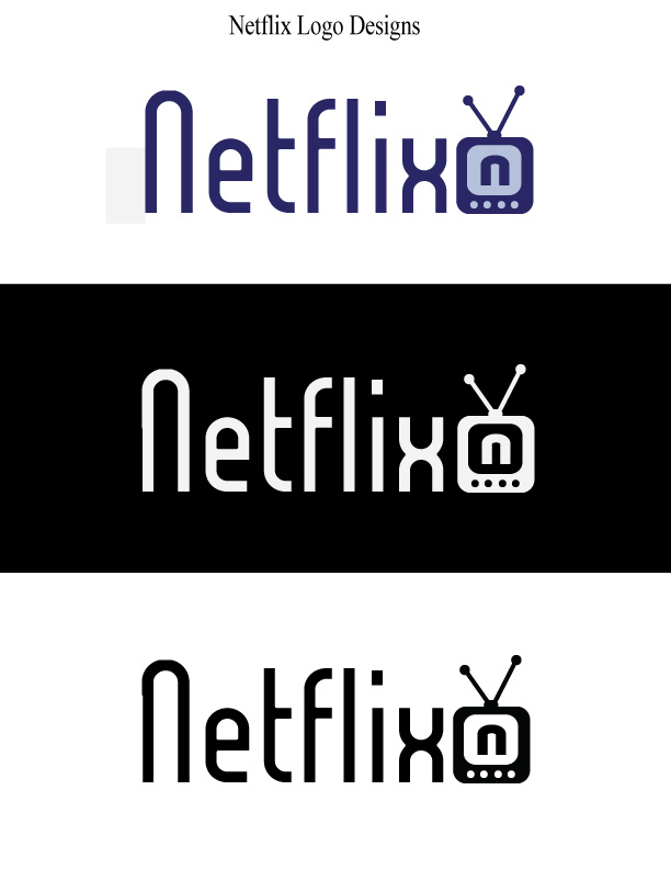
- Description: Demonstrating skills in Adobe Illustrator by designing a unique logo for an already existing company.
- Process (Programs, Tools, Skills): First I brainstormed ideas and made sketches of my brainstorming process to get my creativity flowing. I then took my favorite ideas and recreated my top three logos in Adobe Illustrator. I took a pole from friends and family on which they liked best and which related best to the company. From the feedback, I decided that this design was the best. I had this design critiqued and made adjustments. I then played around with color schemes, added the finishing touches, and made it look presentable.
- Message: The message I am telling with this logo is that Netflix is a company that provides media that you can watch on your TV.
- Audience: The audience I am reaching out to is movie/TV lovers.
- Top Thing Learned: The top thing that I learned is that Adobe Illustrator offers so many wonderful tools, I was able to create the entire logo in this program from scratch which is very handy.
- Color Scheme and Color Names: The color scheme I chose is Monochromatic, it shows various shades of blue.
- Title / Body Font Names & Categories: The font included in this design is called “Lady Ice,” and is a sans serif font.
- Comment
- Reblog
-
Subscribe
Subscribed
Already have a WordPress.com account? Log in now.

Alyssa, your project turned out awesome!I love everything about it. I’m instantly drawn to the company name. The size and font choice you made for Netflix is unique, but in an effective way. The image you created to go with the company name is great because it connects with the company but is not too detailed. Overall, great job! Here’s a link to Abby’s project https://comm130visualmedia.wordpress.com/
LikeLike
Nice job on the Netflix logo. I like what you did with the “n” But my favorite is the little tv. Everything is very well aligned and symmetrical.
https://myvisualexperienceatbyui.wordpress.com/2015/10/30/project-5-logos/
LikeLike
I really enjoy the simplicity of your project, it looks great. I love the design you did with the little T.V., it is a great touch! I also was intrigued by your typography choice as well, I think it looks very modern and a great choice for what you were going for. Overall, the simplicity of your design is what really makes your design so special. I think you did and awesome job! You should check out my logo design: https://nicoleandrew13.wordpress.com/category/design/
LikeLike
Alyssa, I like your Netflix reboot. Hehe. It reminds me of logos for afternoon tv programs I used to watch in middle school and junior high! (Toonami and Zoog Disney) I mean that in a good way. It has a reminiscent feel. I think the only thing I can suggest, is that maybe if you made the first “N” lowercase, it would match your logo more. I think that would create more continuity.
Check out my post, and let me know what you think! https://goodoldkarl.wordpress.com/2015/11/01/p5-logo-design/
Thanks!
LikeLike
Your logo looks awesome! I love how you made a TV and even put a N inside of it. I also really like your typography and how appealing and easy to read it is. I also really like how the tv aligns with the word netflix and that the color scheme is simple.
Check out my logo design at: https://oliviaaanderson.wordpress.com/2015/10/31/project-5-logos/
LikeLike
This is a really interesting take on an already existing logo! I like how it looks retro, almost vintage with the tv and the antenna. I think that it turned out really cute and it looks really good in the black and white and dark background styles. Great job! I think its very cute!
Check out this cool blog!
https://comm130visualmedia.wordpress.com/2015/10/31/project-5-logos/comment-page-1/#comment-25
LikeLike
This is such a creative take on Netlfix. I think it is really clever how you designed a tv into the logo, kind of going back to the classic tv before the flat screens came around. I also like how you can put the log on either black or white and it still pops really well. Nice job!https://memriecromwell.wordpress.com/2015/10/31/project-5-logos/
LikeLike
Nice logos Alyssa! First of all I think your actual logo was really creative and looks really nice. I liked how the logo was at the same level as the “x” and “i” and had nice alignment. I also thought your font was cool, it is modern looking and edgy which I think is necessary to get peoples attention. I think my favorite one is the white on the black background. It really stands out and looks clean to me. Overall you did a great job! If you ever get some time come check out my blog at: https://tysonbeckley.wordpress.com/
LikeLike
This is a fun logo! I loved the font used for the title of the company. It is simple and elegant while also being edgy and modern. The entire design is simple, neat and straightforward, easy to understand and remember. I like that you put the symbol of the old fashioned TV aligned with the company title, it is friendly – not as harsh, or as confusing as using a modern flatscreen as an ambiguous rectangle next to the title would be. Ariana’s blog is also simple yet edgy, you should check it out: https://arianacedillo.wordpress.com/2015/11/01/project-5-logos/
LikeLike
Hey! I think you did a great job this week with your design. This was a difficult assignment for but it seems like your becoming familiar with Illustrator. Although Netflix is known for it’s red color scheme, I like how you used a very different typography for your design. I like how it’s organic and you continued to use round shapes throughout your logo. I hope for this week’s assignment I can be more comfortable with the program. What are some suggestions you have for my design? Check it out!
https://arianacedillo.wordpress.com/2015/11/01/project-5-logos/
LikeLike